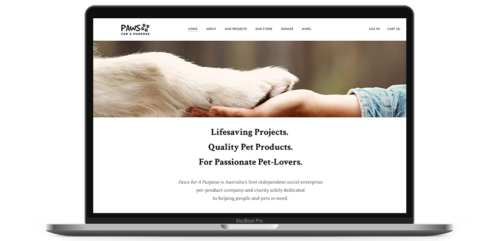
About Paws for a Purpose

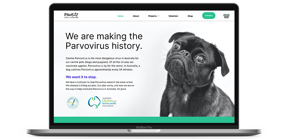
Paws for A Purpose is a registered Australian charity with the goal of stopping Parvovirus and helping people in need with their pets, through donations, volunteering and dog treat sales.

Project brief

Re-branding and improvement of the experience and flow of the volunteering section of the Paws for a Purpose website.

Duration

9 weeks
Scope
  • Human-centred research
  • Wireframing
  • Usability testing
  • Final prototype
  • Branding

Feedback

Amelia Metcalf
CEO of Paws for a Purpose

“You’ve done an amazing job. I love how clear the layout is and how our mission stands out and is easy to understand.”

Adam Marques
Veterinary doctor

“This new version of the website is much more engaging, and it is now clear what the [Paws for a Purpose] mission is. As a vet, I would be much more likely to get in touch with them and help achieve their goal.”

Jacqueline Hanson
Volunteer

“I can now understand  what the process is and I would be keen to consider sending an expression of interest to join this organisation.”

Research

Understanding business needs

Why did they come to me?

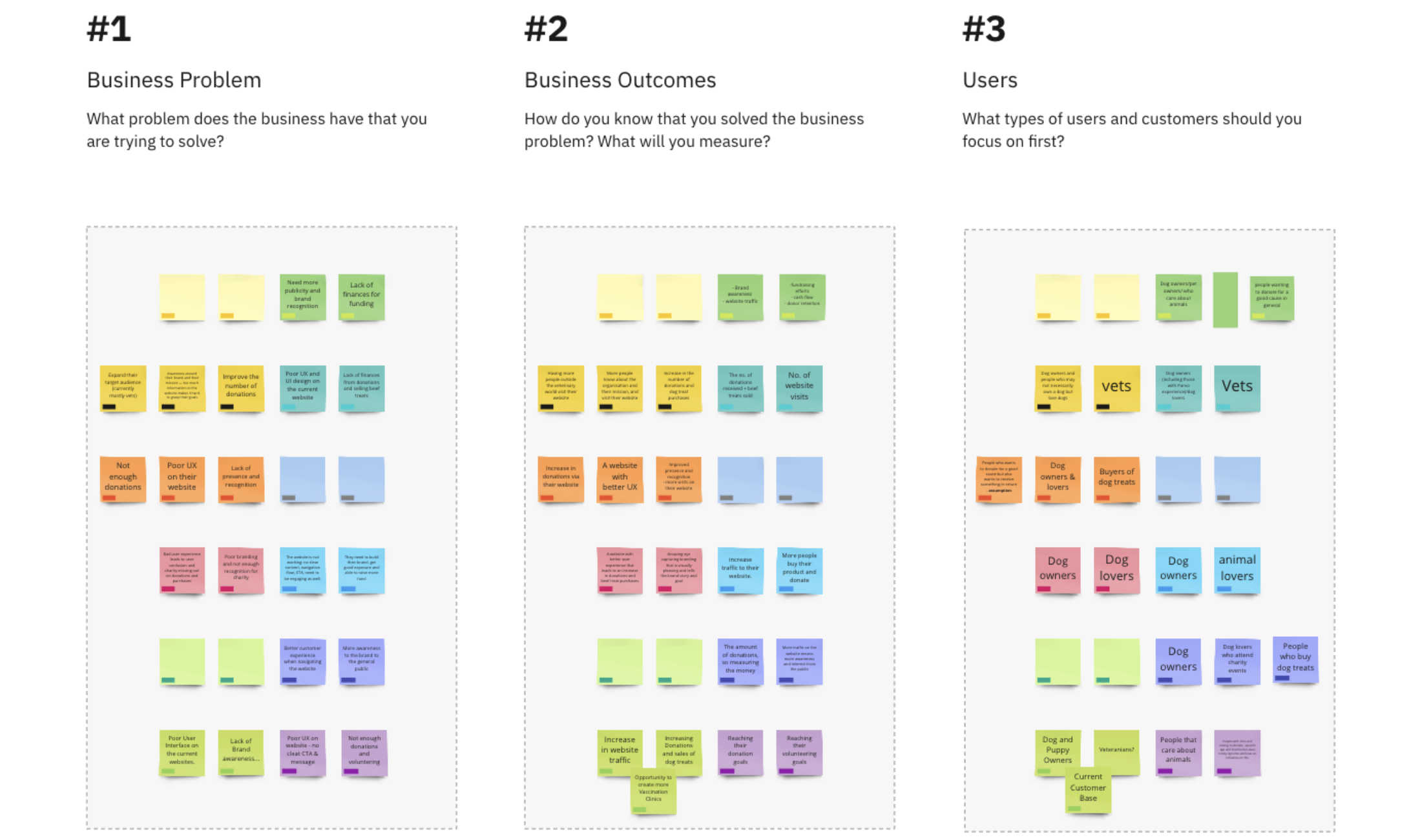
As NFP, finances were naturally a great concern, and so was the need to increase donations and the number of volunteers. However, as important as money may be, other concerns were raised. An opportunity canvas was created to assist with better understanding goals, potential setbacks, strategies, challenges, and metrics.

What outcomes were expected?
▹ Cash flow
Fundraising efforts, donor retention, and an improved shopping cart.

▹ Brand recognition
More consistency throughout the website, a clear mission statement and an improved interface.

▹ Friendlier flow
A clear experience, that creates more awareness and can attract a different target audience.

Competitive analysis

What are other NFP organisations doing?

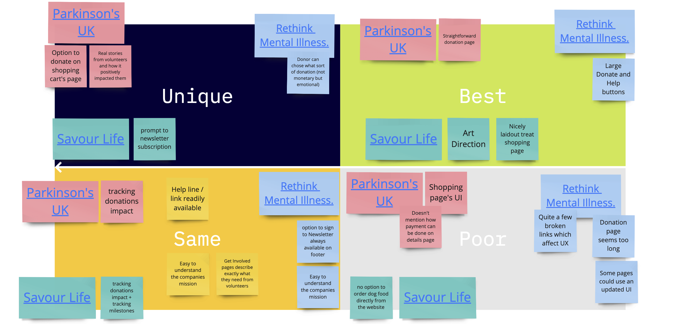
To better understand the needs of volunteers, I have run a competitive analysis. This analysis included Parkinson’s UK, Savour Life, and Rethink Mental Illness. The goal was to identify how successful NFP organisations, present their mission and objectives to their audiences, as well as enticing them to volunteer to their cause.

Key findings and JTBD
  1. Ambiguity ▹ Transparency
    towards volunteering options
  2. Untrustworthiness ▹ Trust
    towards the organisation regarding branding and UI
  3. Opportunity ▹ Convenience
    desire towards skill-building while volunteering

Persona & their journey

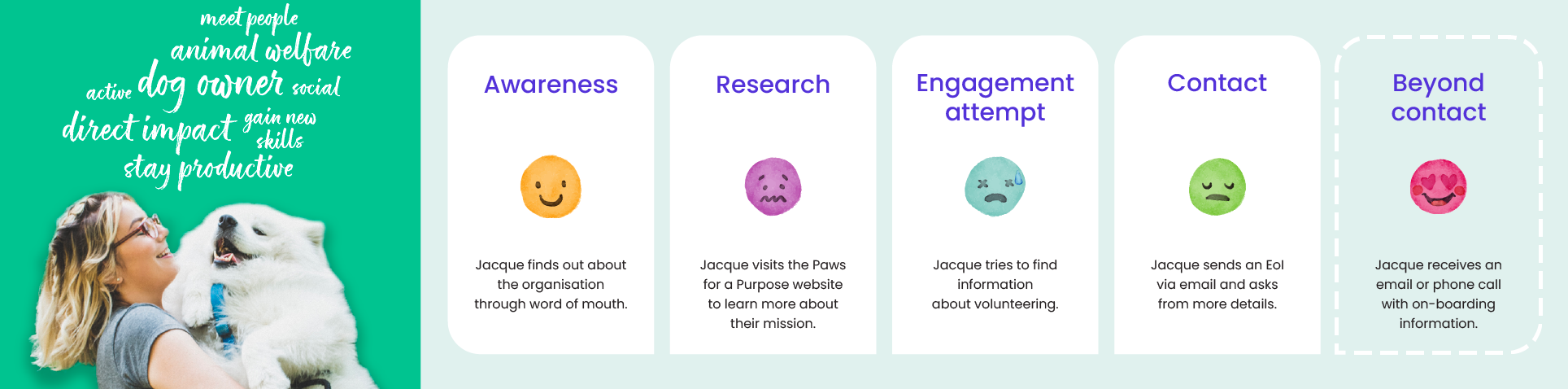
A persona and their journey were designed, after conducting interviews. These interviews targeted volunteers at pet-related NFP organisations, one vet, and dog lovers. The Journey Map includes a final step, aiming to improve the experience of volunteers, reducing confusion and increasing the chances of referrals.

Sketches & Wireframes

Sometimes the first ideas aren’t the best

Crazy 8s design sprint

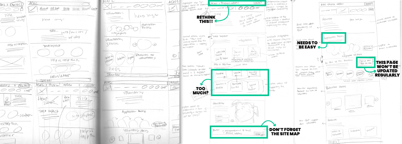
After conducting research, I moved on to sketching. This enabled me to quickly try some options and experiment with different layouts. I explored different blocks of information, thought about content and hierarchy, and alternated between text and imagery, to create a cleaner layout that was easier to navigate, and highlighted the mission of the organisation.


BTW — My Crazy 8 sketches might not be award-winners, but they do help me unleash ideas.

Lo-Fi wireframes

Improved sketches

After understanding what could work, and what probably wouldn’t, I started messing around with Figma. The end goal was to create simple lo-fi wireframes that were clean and descriptive enough to start testing with some humans. I tried not to, but I ended up including some animated GIFs to break the ice with some of the awesome people who offered to test the initial layout.

Testing lo-fi wireframes

The first round of usability tests was done on lo-fi wireframes. The task list included:
  • Understanding if the mission of the organisation is clear
  • Navigating to the volunteering section of the website
  • Signing up to volunteering
  • Filling out an application form
  • Trying to make a donation
Being the first round of tests, some details needed more work and ideation.
  • The mission is now clear, but copywriting still needs improvement
  • Easy to find the volunteering section, but the resources section is confusing
  • Available volunteering opportunities are still not clear — there is no motivation to sign up to volunteering
  • Irrelevant questions in application form
  • Donating and buying dog treats seem like the same to most visitors

Hi-fi wireframes

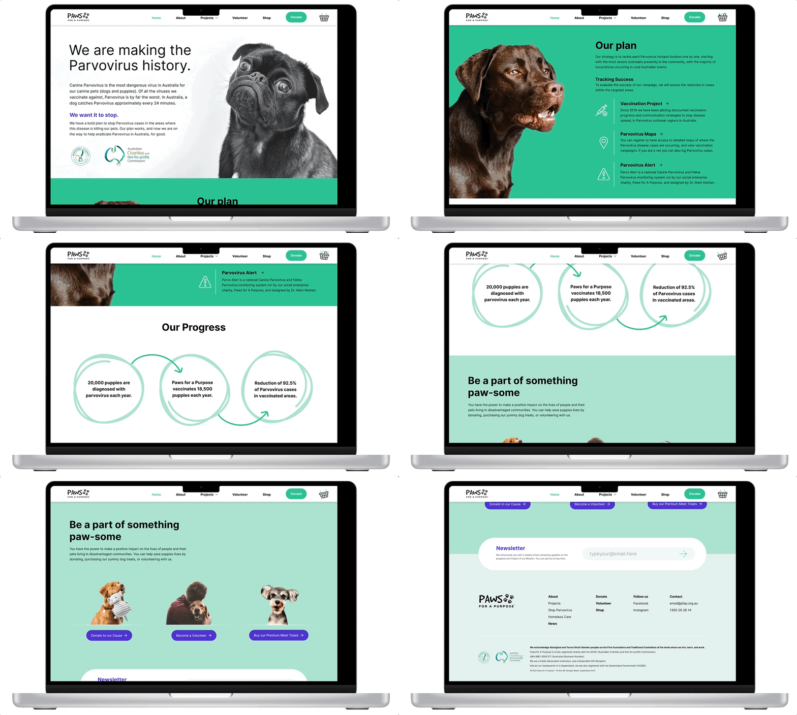
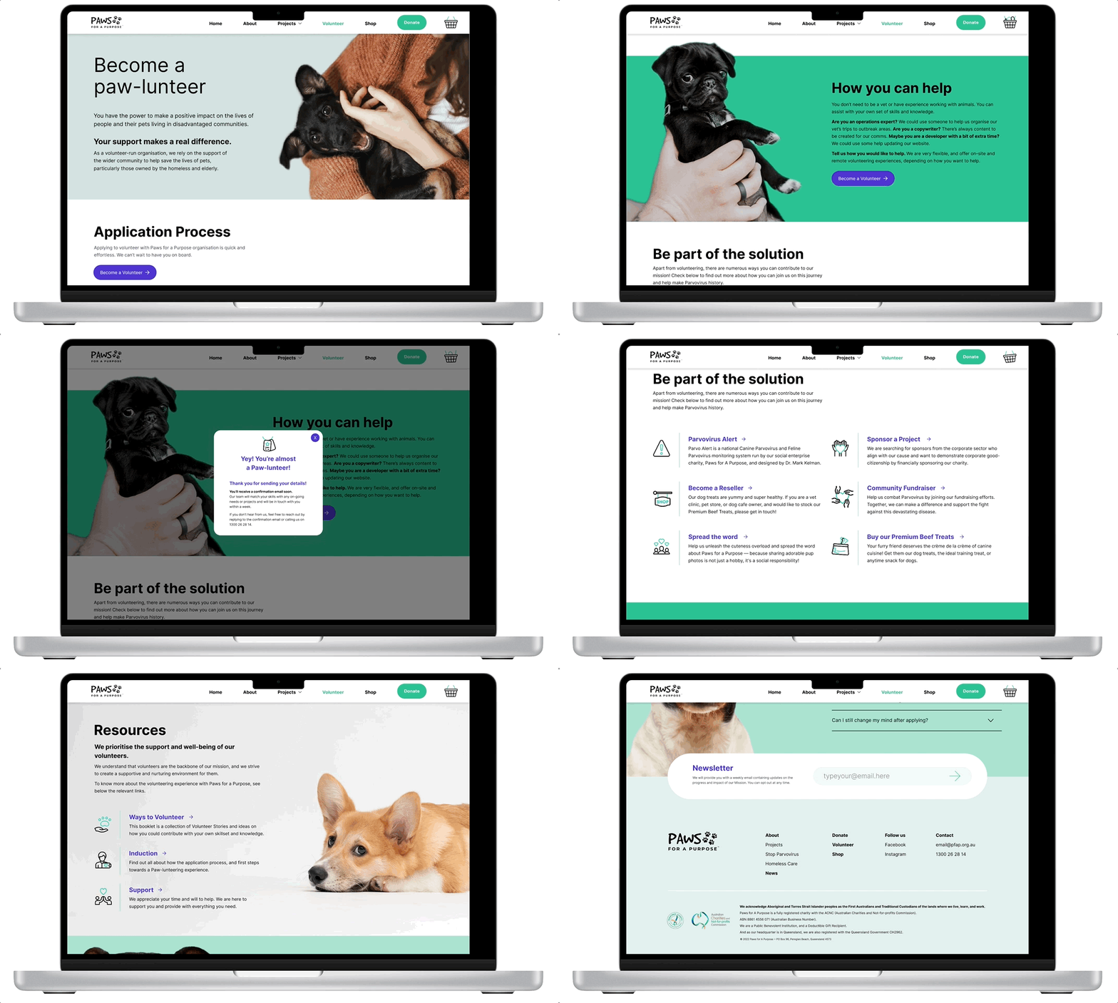
Usability testing on hi-fi wireframes was better received. I felt that testing on a branded prototype worked best. Visitors felt they could trust the organisation more and were more engaged.

  • Colour psychology and contrast were considered for branding and accessibility purposes
  • Images were retouched for brand consistency and recognition
  • Candid photography was used for volunteering sections
  • Hierarchy and layout were taken into consideration to improve flow and readability
  • Text was significantly reduced  to facilitate a quick understanding of the organisation
  • Main nav is sticky, making it easy to access important pages, such as donation and shop
What really made a difference?
  • Adding the ACNC to the top and footer of the page
  • Including a Success and Progress tracking section on the home page
  • Making it clear how the audience can support the organisation
  • Simplifying the volunteer application process
  • Clarifying how to be part of the solution
  • Showcasing volunteering stories