About This Way Up

THIS WAY UP is a trusted Australian provider of evidence-based, internet-delivered Cognitive Behavioural Therapy (iCBT) treatment programs.

Project brief

Enhancement of the patient experience on This Way Up’s dashboard.

Duration

6 weeks
Scope
  • Ideation based on previous Human-centred research
  • Human-centred research
  • Wireframing
  • Usability testing
  • Final prototype
  • Design handover documentation
  • Branding

Feedback

Tanya Vearing
[during usability test]

“It’s very easy and intuitive to continue with my lessons and find new programs. I love how I can track my progress, and schedule the next lesson on my calendar, just as if I had an appointment with my psychologist.”

Dr Audrey Rollin
Product Manager

“The labelling of the scores under progress tracking is great. Moving away from the technical names makes it easier for the patient to understand how they are improving.”

Zoe Perkins
[during usability test]

“It’s much easier to access the wellbeing audio and to download all the resources and materials I need.”

Key Performance Indicators

What previous research has shown

Better navigation between psycho-education content and practice skills
▹ Why?

Previous research showed that majority of patients do not know where to find the content/resources for each lesson. They found it particularly hard to find the mindfulness audio resources.

Ability to better track progress
▹ Why?

There is confusion about how to implement extra resources with lessons. It is not clear how patients are progressing.

Better adherence to TWU treatments
▹ Why?

Difficulty filling resources digitally, particularly on mobile. There is too much text on the screen.

Research

Previous research had been done, which included patient personas and journeys. However, I decided to run a competitive analysis and heuristic evaluation, before moving on to sketching.

Heuristic evaluation

Key takeaways:
  • Sign-in/out
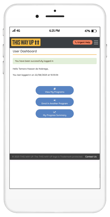
    The patient is not able to log in or log out directly from the main navigation bar.

  • Back button
    The ability to return to previous pages is not available on some pages.

  • Resume lesson
    After logging in, the patient has to click three times before continuing with their lesson. They may still need to scroll down.

  • Progress
    The information about patient progress is very hard to read (sometimes impossible) and there is a poor hierarchy of information.

Competitive analysis

Key takeaways:
  • Flo
    The first thing we see on the dashboard is the ability to ‘log period’ — focusing on the main reason why the user visits the platform. Horizontal scroll to organise information within each section.

  • Calm
    It is possible to easily access all information from the dashboard. Horizontal scroll to organise information within each section.

  • Smiling Mind
    The human-friendly bottom nav bar helps the patients to easily access all information.

  • Qantas Wellbeing
    The constant incentive to work towards goals is highlighted, by celebrating every small victory.

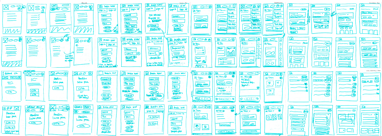
Sketches & Wireframes

Blue pen reflections: sketching a mindful design

First thoughts and moving forward
▹ Bottom nav

A good option for an app, to store all important information. The patients can easily access what they need in one easy click.

▹ Dashboard landing page

Ideally, all important information should be available as soon as the patient logs-in to their account.

Exploring solutions based on usability testing

Usability testing was conducted on a lo-fi prototype in order to explore possibilities, identify problems and design features that can be useful to the patients.

The solution — Focus area 1

Dashboard landing page

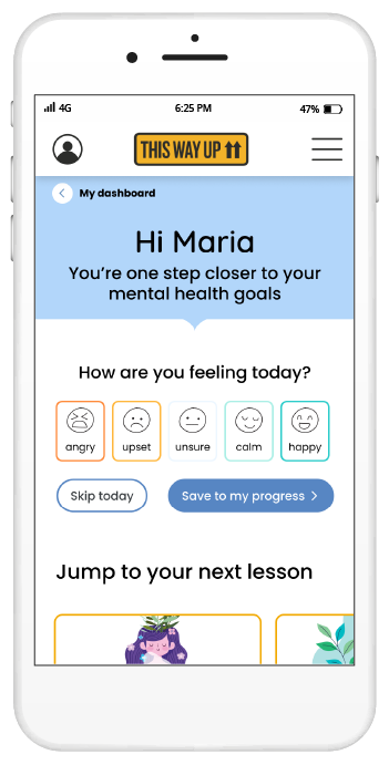
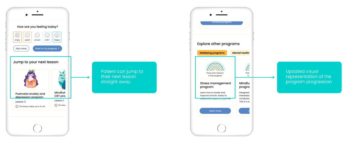
After signing-in, the patients are able to continue with their next lesson in one click, even if they are enrolled in two programs at the same time. They can also easily access other information from their dashboard.

Usability testing key findings
▹ Jump to your next lesson

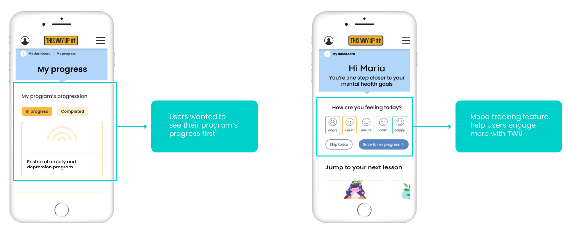
This was the most important thing to all users, apart from the “How are you feeling today?” section

▹ Program progress

Initial user testing showed that it was not clear that each rainbow line corresponded to a lesson. Labelling was introduced to clarify.

The solution — Focus area 2

Types of content

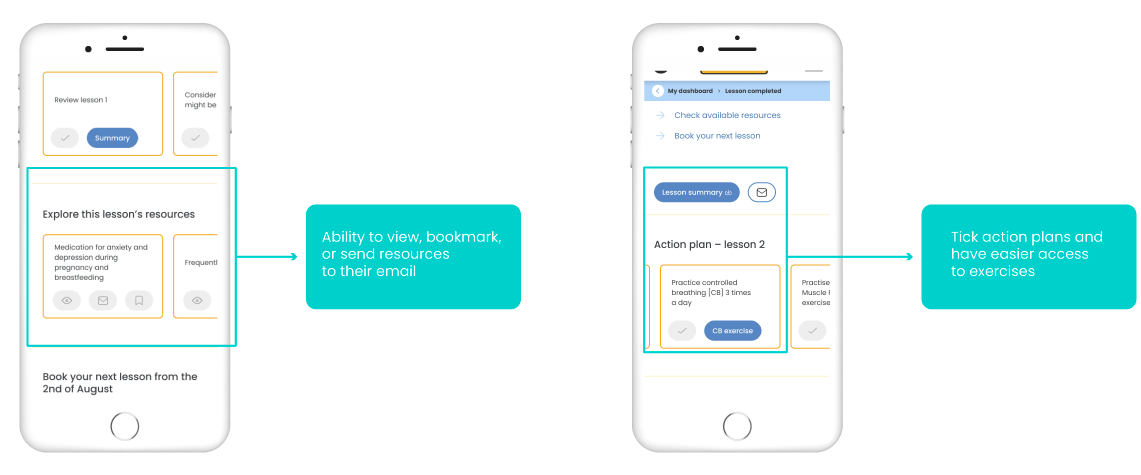
Lesson summary, action plans and resources are labelled more clearly. Patients can check action plans (and access exercises immediately), view, download and email all documentation.

Usability testing key findings
▹ Resources

All users would prefer to read the resources on screen or send them to their emails. 50% of users would like to send/download all their lesson resources at once.

▹ Action plans

All users enjoyed being able to tick the action plans they had completed. They all wanted to have a reference to specific exercises.

The solution — Focus area 3

Progression section

Less text on progression screen and visual translation of ‘mood’ makes it easier for users to understand how the course is impacting their mental health.

Usability testing key findings
▹ Hierarchy

50% of users assumed that “progression” was related to their Programs and not their mental health. Questionnaire scores and the “mood tracking” feature were a nice plus.

▹ Mood tracking feature

All users enjoyed using this feature. After it disappears from their dashboard, they would like to be able to find it again under “My progress”.

Final prototype

Dashboard

The updated dashboard enables the patient to track their mood, jump onto their next lesson, explore other treatments, and access the mindful audio of the day, as well as others.

Next lesson

After tracking their mood (or skipping it), the patient can easily jump onto their next lesson. At the end of it, a short animation indicates how far they’ve come and how many lessons remain to complete their program.

Lesson materials and resources

When the patient finishes their lesson, they can download or email their lesson summary, review their action plan (and tick what they already did), explore other resources that are useful to their treatment, and book their next lesson in their calendars.

Tracking progress

An updated Progress screen visually shows how the mood is improving (or not), as well as their levels of distress, depression, and anxiety. A more human-friendly labelling system makes it easier for the patient to understand how they are developing. The technical and medical terms can still be viewed, but not at first glance to not overwhelm the patient. Quick tips to improve mood were added as an extra to improve interaction.